
Screenprints
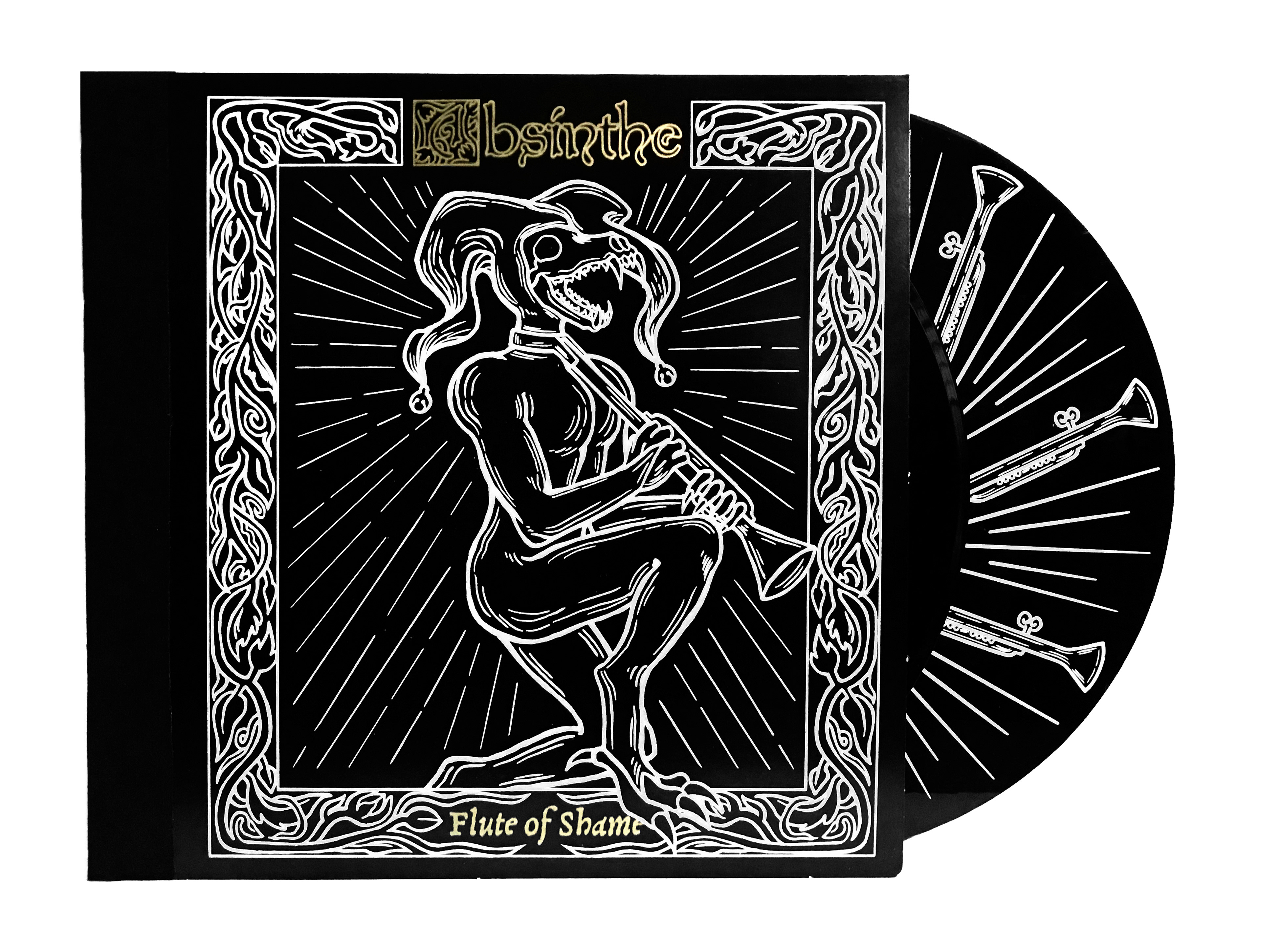
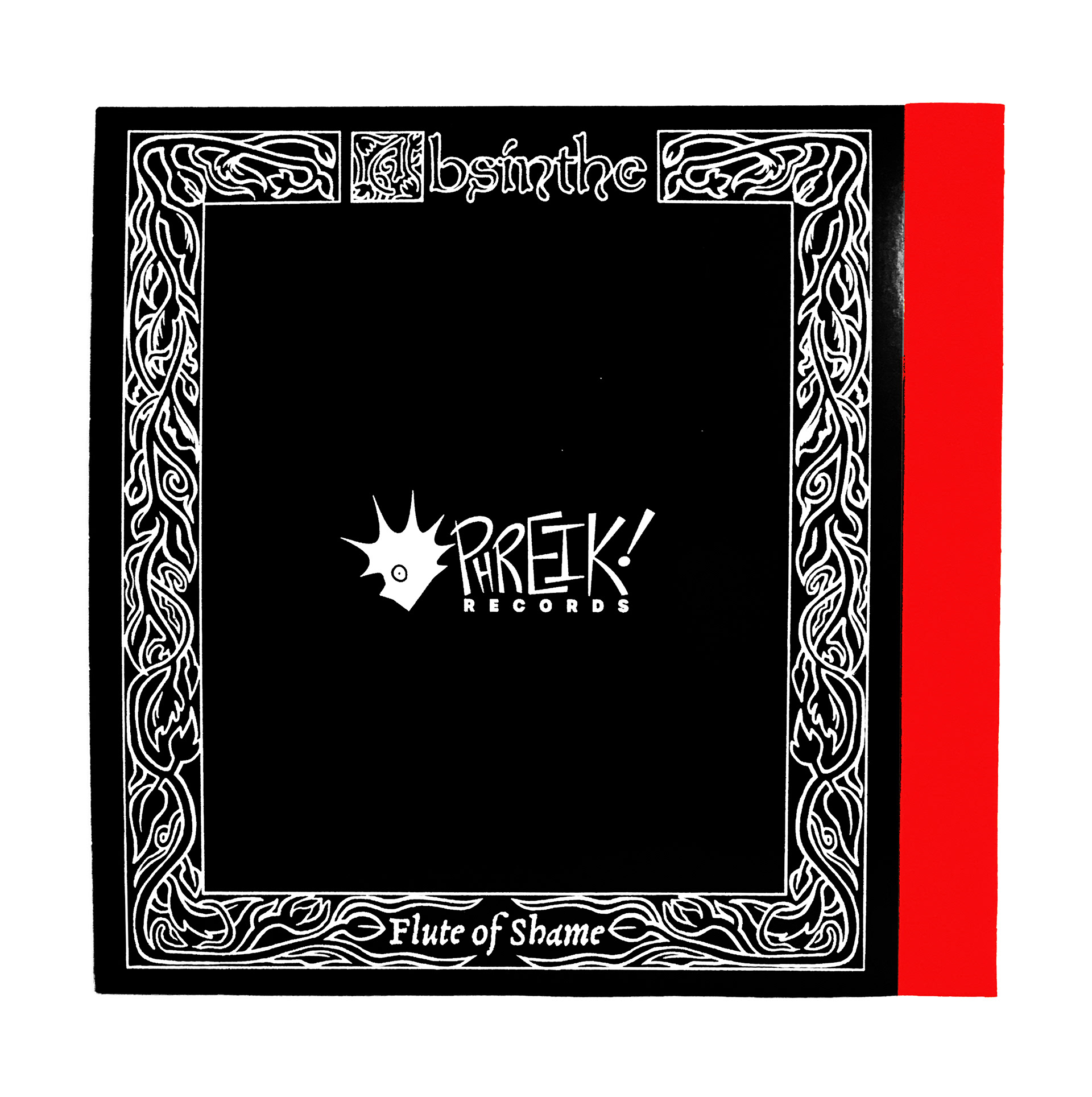


Absinthe is a band I created for my hypothetical company PHREIK! Records. The band's merchandise is very tactile with special edition vinyls and vinyl jackets being curated for a unique experiece for their fans. I created examples of each for the project.
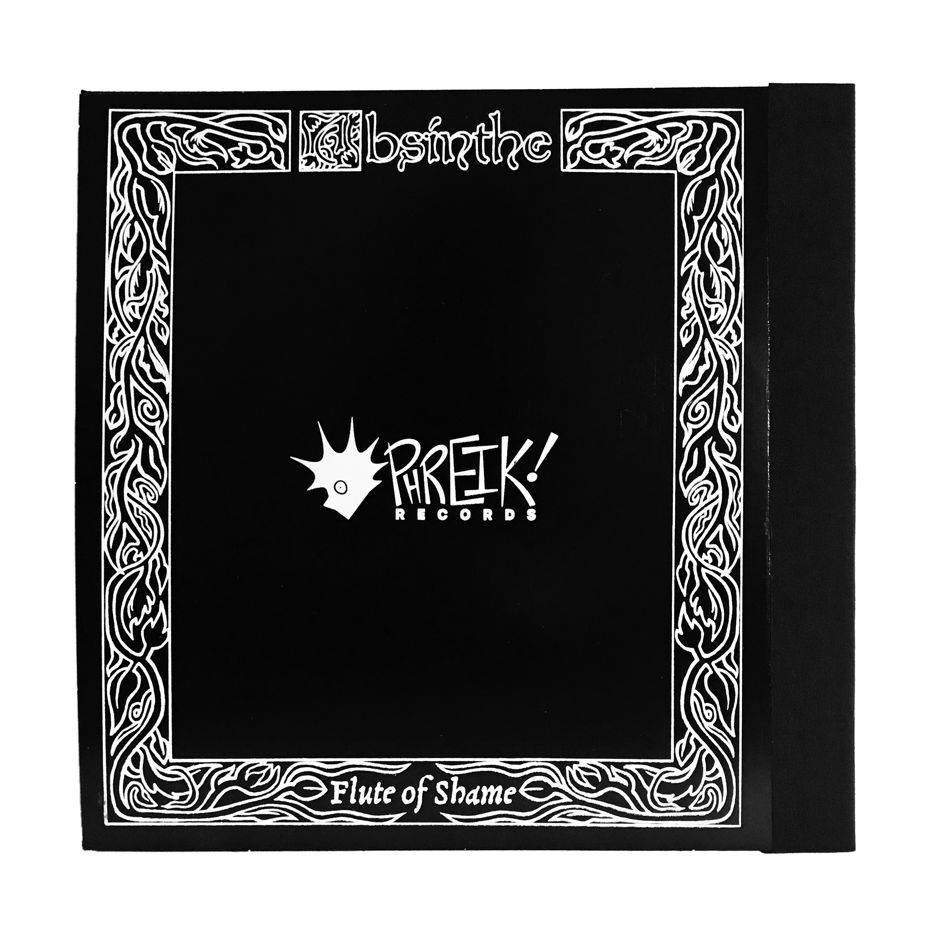
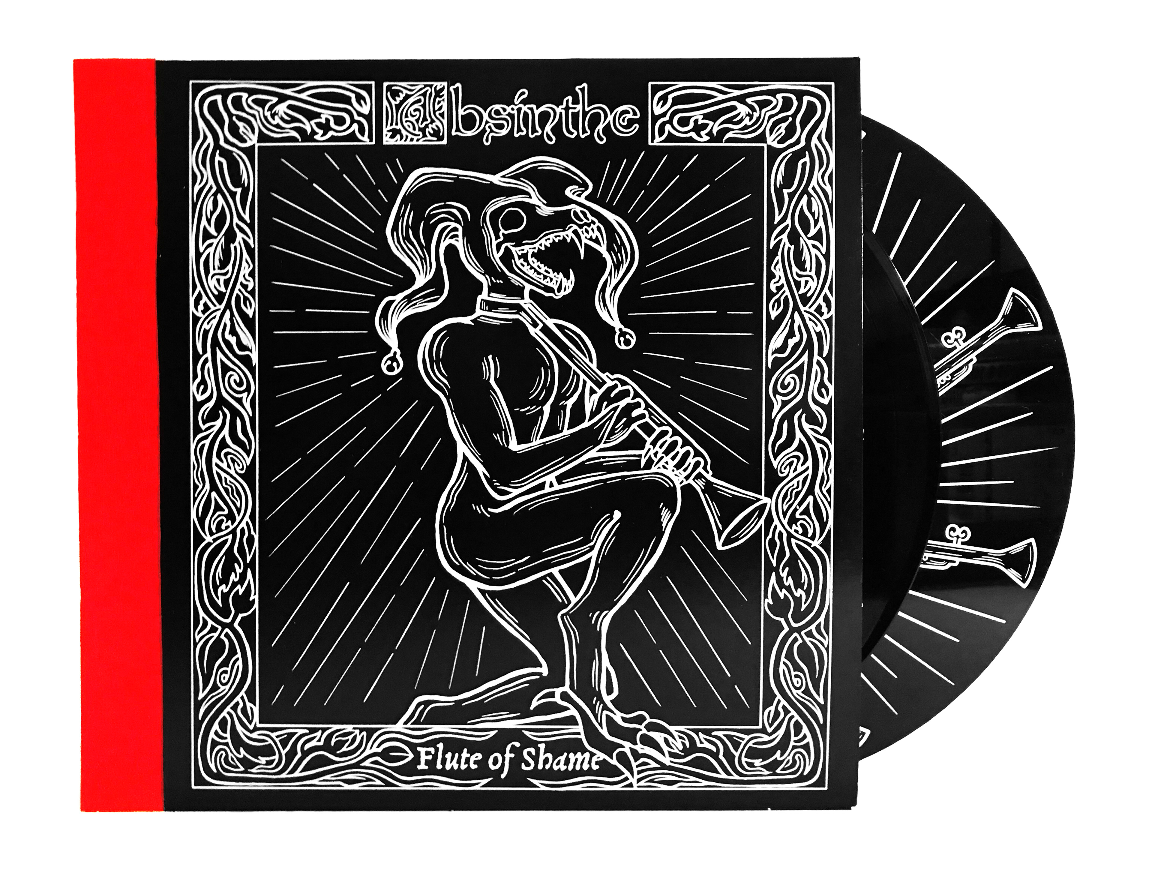
The vinyl jackets are screenprinted and then bookbinded using thread and bookcloth to create a gatefold jacket. There are two versions; one utilizing black cloth with gold and white ink, and another utilizing red cloth and white ink.
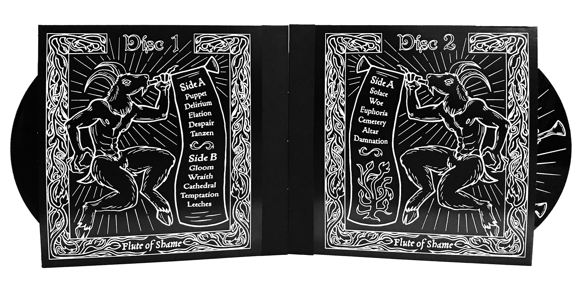
The B side of disc 2 has a screenprinted design.
The B side of disc 2 has a screenprinted design.
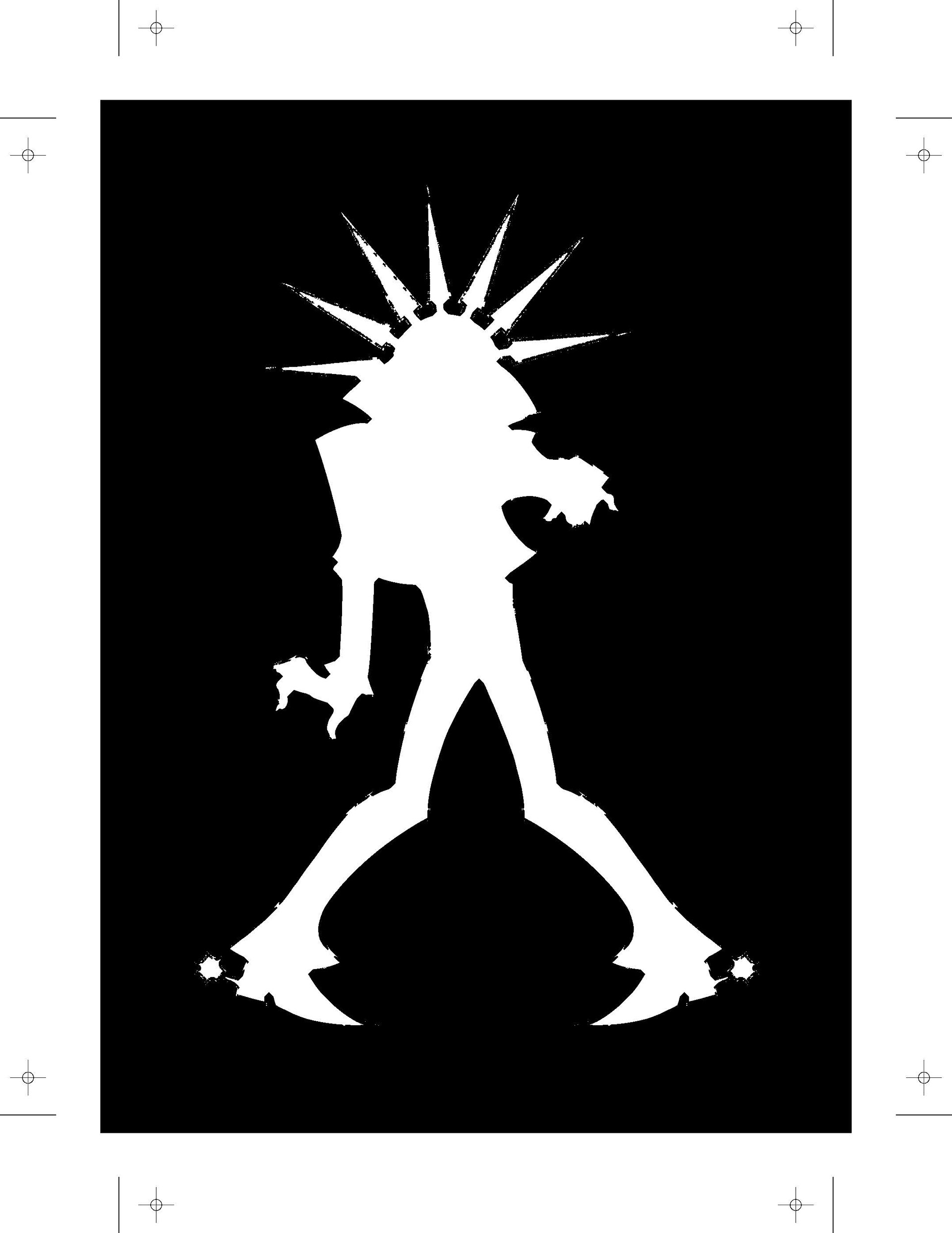
Yellow Layer
Red Layer
Blue Layer
Red Text Layer
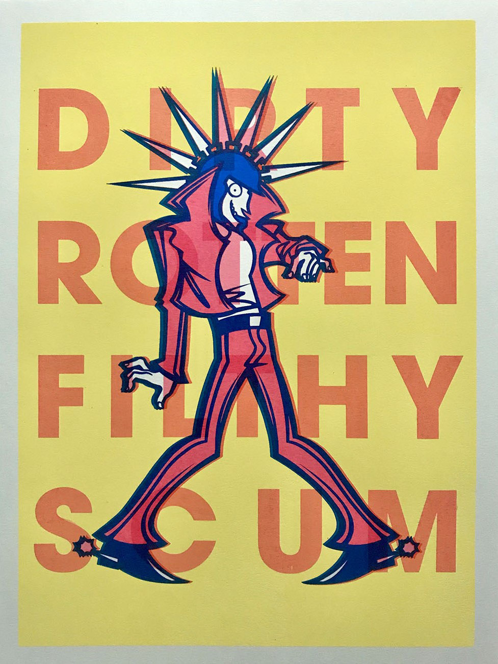
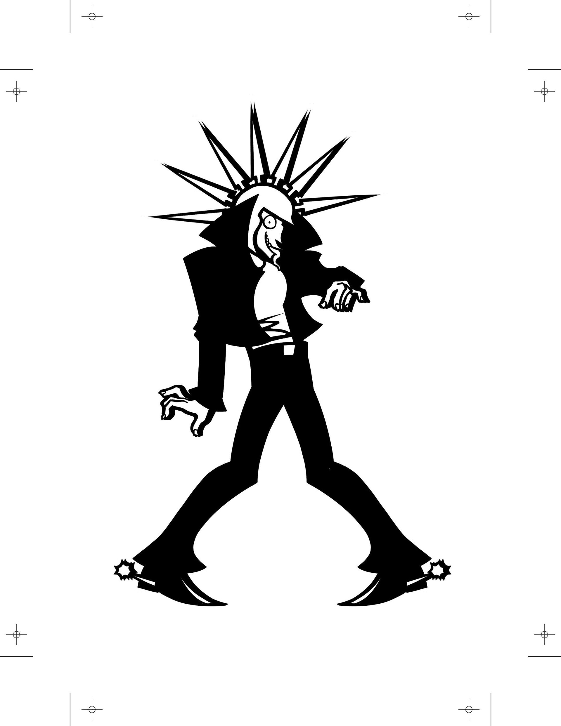
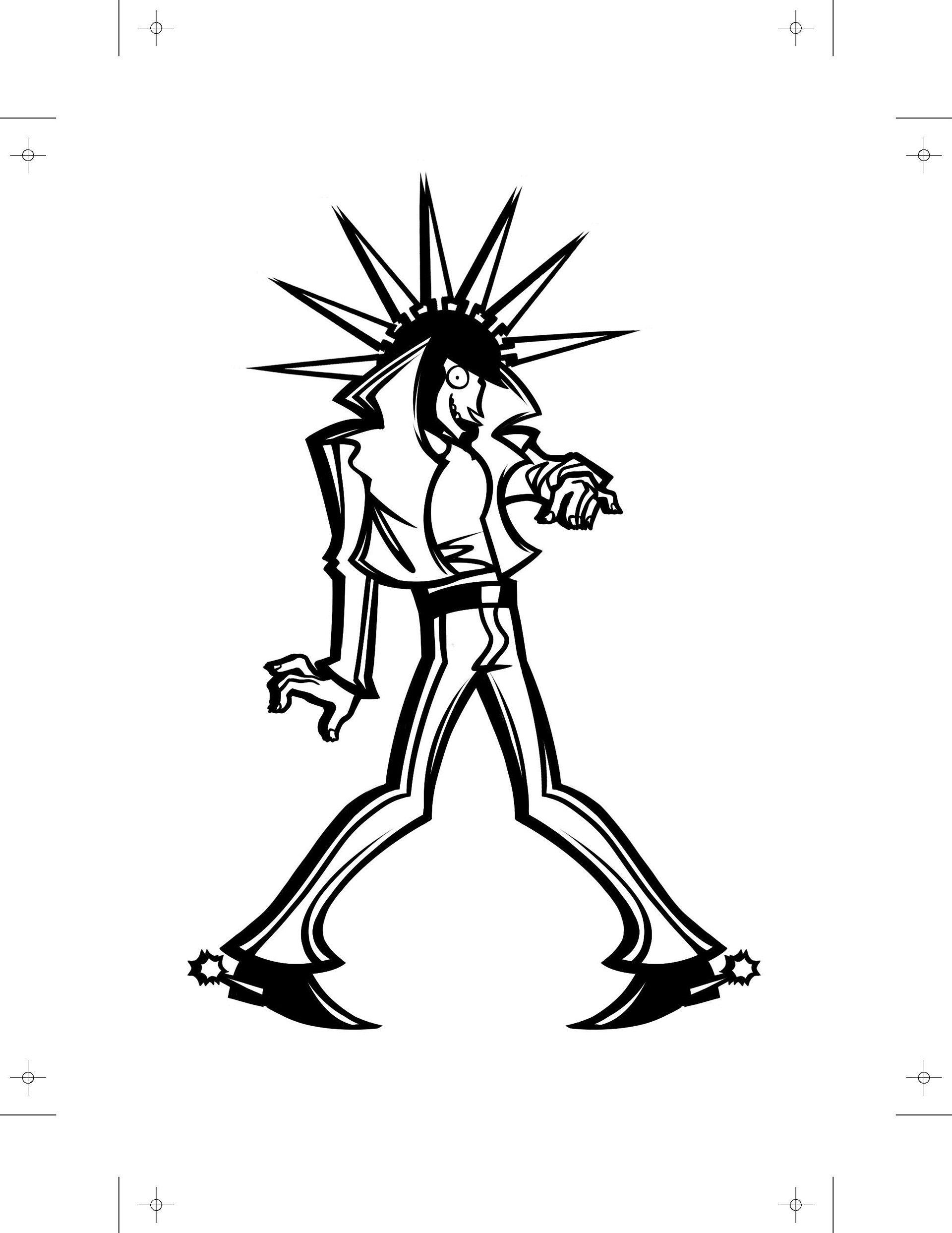
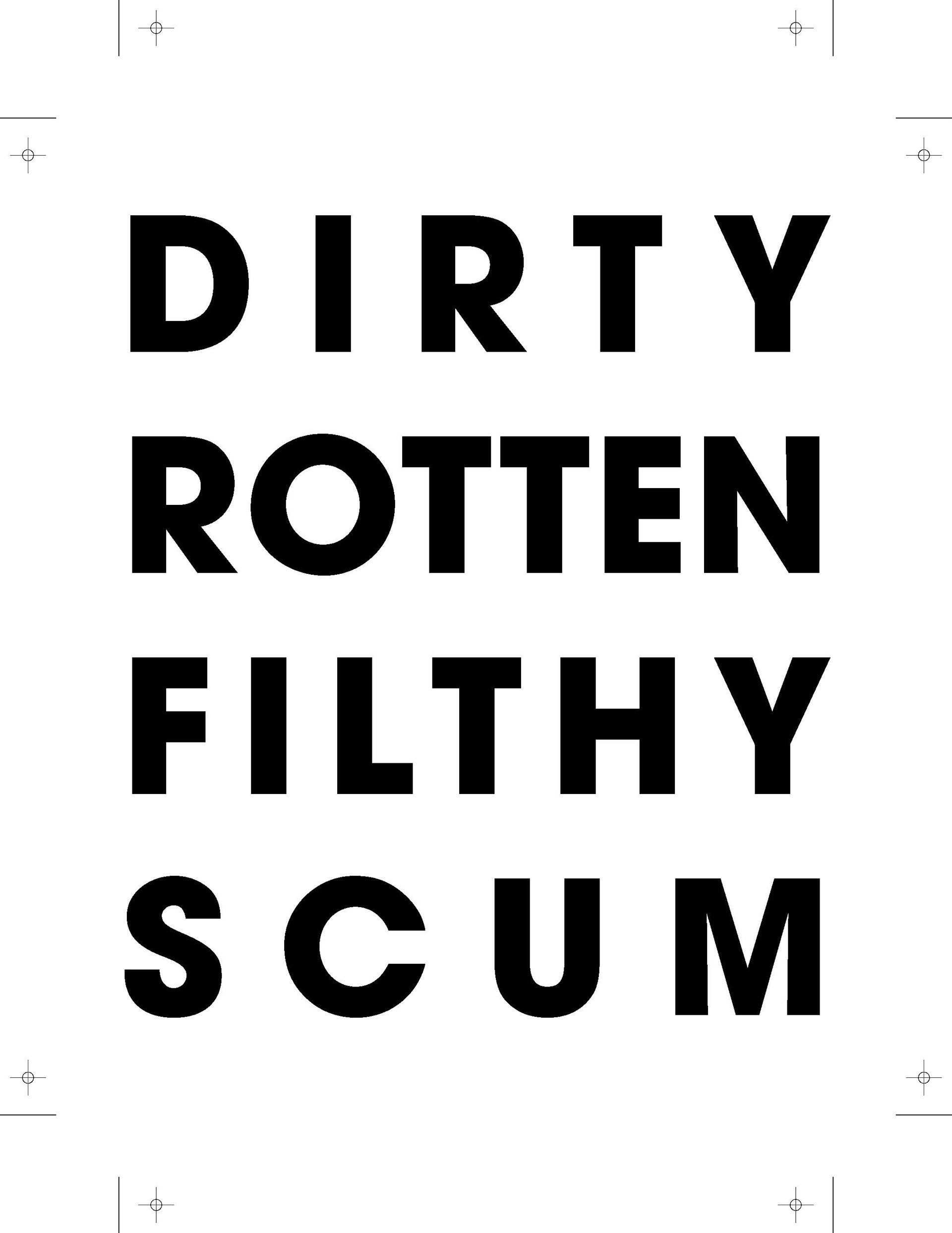
This print of my original character Danny is based on the song I'm Scum by IDLES. Each piece is screenprinted by hand, so each has its own effects and defects that enhance the grungy, punk aesthetic of the piece. A1 series is printed on the smoother side of the paper, making the print more even and clear. B2 series is printed on the rougher side, giving it more grungy and uneven elements.
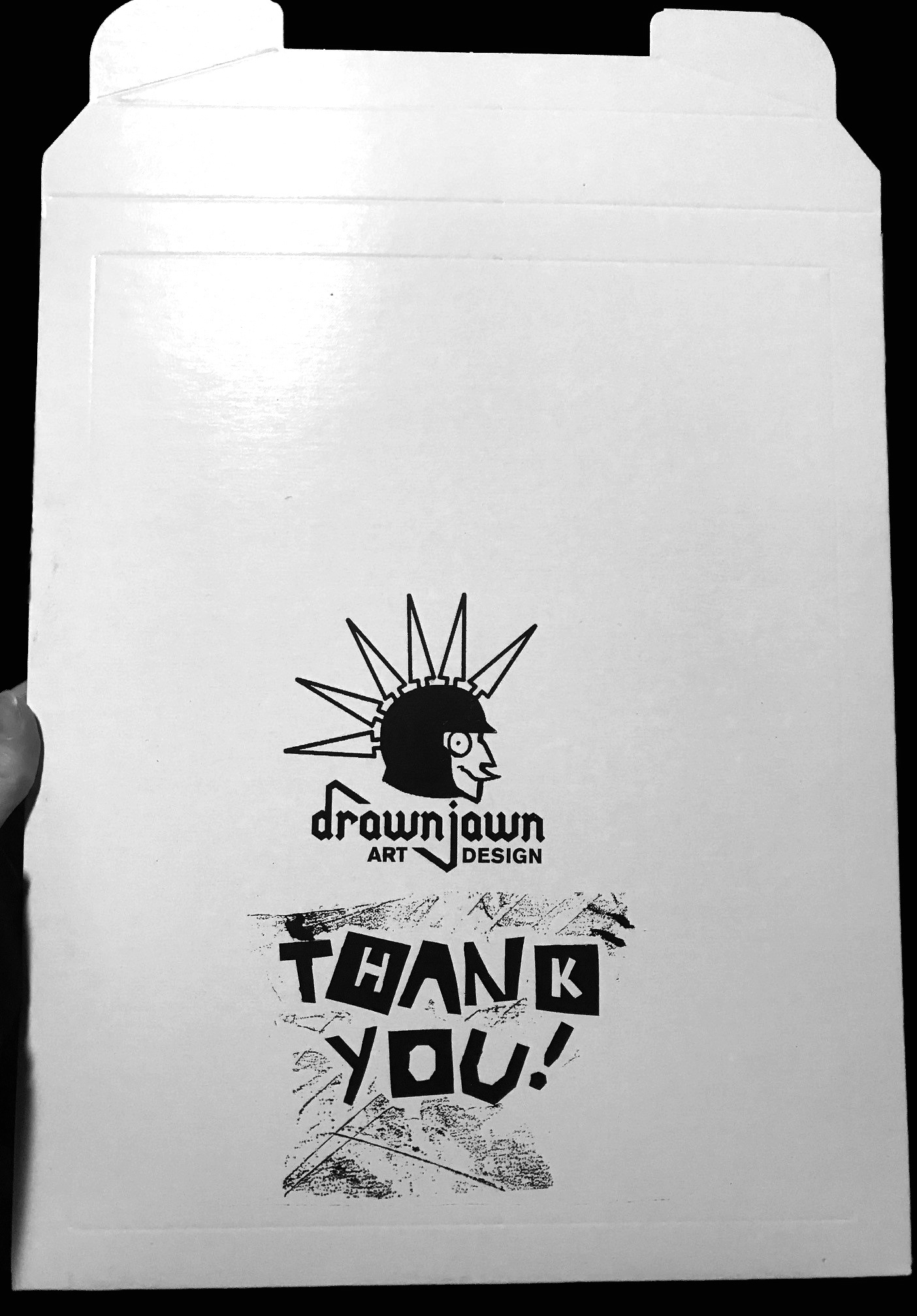
I screenprinted on some mailers to mail out my prints. I digitally made my logo but used cut paper for the Thank You message and attached it to tape. The tape got caught on some other paper but the grungy effect it made when pulled off was interesting so I decided to use it. I think of it as an art piece on its own, even if it's being used on mailers. The grunge and punk aesthetic speaks to my personal brand and the handlettering was something I've always wanted to try.